Collection tabs
A product grid with tabs: New in, Best sellers, Sale or any collections in one section, each with a View all link. Accessible tabs, works without JavaScript.
- Category
- Product and collection discovery
- Use on
- Home, Landing pages, Collection
- Reads
- Collections and their products
- Size
- 39 KB, small script included
- License
- MIT, free for client work
In short
Collection tabs is a free Shopify section that puts several collections in one product grid with tabs, such as New in, Best sellers and Sale. Each tab is a block with a collection picker and an optional label, shows up to 16 products as cards with price, badges and an optional quick add, and can end with a View all link to its collection. All products are rendered by Liquid, so search engines and shoppers without JavaScript see every group in turn; a small script turns them into keyboard-accessible tabs. It works in Online Store 2.0 themes without an app.
When to use it
- A home page block with New in, Best sellers and Sale, instead of three featured collection sections
- A gift guide landing page with one tab per budget or recipient
- A collection page with tabs for sub-ranges (Mugs, Plates, Bowls)
In the theme editor
- Heading (tag H1–H3 or paragraph, three sizes), intro text and tab list name
- Tab blocks: collection and optional label (up to 6)
- Pill or underline tabs, View all link per tab with button style
- Products per tab (2–16), image shape, plain or card style, corner radius
- Vendor, second image on hover, quick add, sale and sold-out badges
- Columns on desktop (2–6) and mobile (1–2), grid or swipeable row on mobile
- Page or full width, heading and tab alignment per device
- Background color or gradient, text, accent, text on accent and card colors
- Top and bottom padding per device, show on desktop/mobile only, anchor ID, fade in when switching tabs
Files
sections/lib-collection-tabs.liquidView the code
snippets/lib-product-card.liquidView the code
snippets/lib-image.liquidView the code
snippets/lib-button.liquidView the code
Written in plain Liquid and CSS with a small script. No app, no dependencies.
How to add it to your theme
- Copy the section file into your theme’s sections folder, and any snippet it lists into snippets.
- In the theme editor, choose Add section and pick the one that starts with “Lib ·”.
- Replace the sample text with your store’s own, and set the colors to match your brand.
Questions
- How many tabs can I add?
- Up to six. Each tab is a block with a collection; its label is the collection's title unless you type your own. With one tab the section shows a plain product grid without a tab list.
- Are the tabs accessible?
- Yes. They follow the WAI-ARIA tabs pattern: real buttons in a tab list, the arrow keys, Home and End move between tabs, the selected tab is announced, and each panel is labelled by its tab. Focus is always visible.
- Do search engines see the products in hidden tabs?
- Yes. Every tab's products are in the page's HTML; the script only hides the panels that aren't selected. Without JavaScript the groups show one after another with their own titles.
- Can shoppers add to cart from the grid?
- Turn on quick add: single-variant products get an add to cart button (Shopify's own product form), products with options link to their page with "Choose options".
Before you publish
- The text in the demos is sample content. Replace it with facts about your own store before you publish.
- Animations are switched off for visitors who ask for reduced motion.
- We check every file with Shopify Theme Check before publishing it here.
Need it adapted to your theme, or a section that isn’t here? See Shopify theme development.
More sections
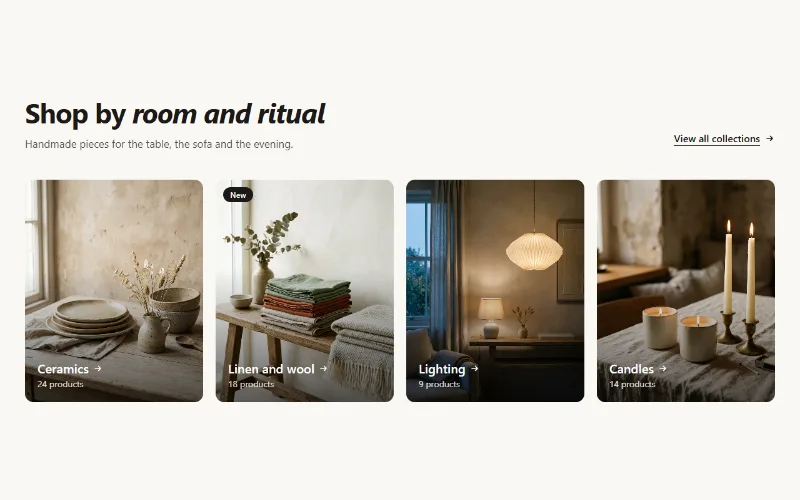
Product and collection discovery
Collection cards
Up to eight collection cards with image, title, label and product count. Text over the image or below it, 2 to 5 columns, or a swipeable row on mobile.
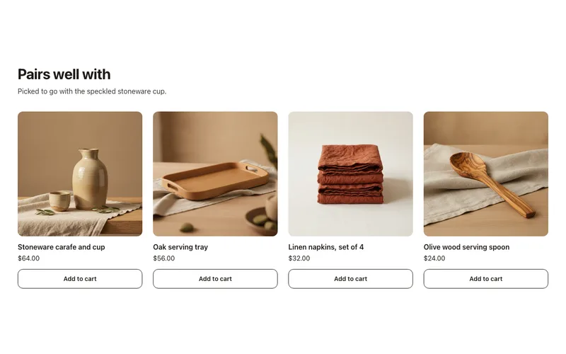
Product and collection discovery
Complementary products
"Pairs well with" cards on product pages from Shopify's complementary product recommendations, set in Search & Discovery, with quick add. No app fees.
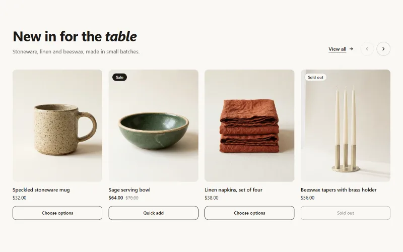
Product and collection discovery
Featured collection
Product cards from one collection as a grid or swipeable carousel, with hover image, sale and sold-out badges, and a quick add button.
