Shoppable image carousel
Swipeable row of lifestyle photos, each with up to three product hotspots that open a product card, plus plain product links under every photo.
- Category
- Image and video
- Use on
- Home, Collection, Landing pages, Lookbook
- Reads
- Products you tag on each photo
- Size
- 38 KB, small script included
- License
- MIT, free for client work
In short
Shoppable image carousel is a free Shopify section that shows several lifestyle photos in a swipeable row, each with up to three product hotspots. A hotspot opens a small card with the product's image, price and link, and the products in each photo are also listed as links under it, so they work without JavaScript. The row scrolls with touch, trackpad, keyboard or the previous and next buttons and never moves on its own. It works in Online Store 2.0 themes without an app.
When to use it
- A room-by-room lookbook on the home page where every piece can be bought
- Seasonal campaign photos on a collection or landing page, tagged with the products in them
- Styled outfit or table-setting shots that lead straight to the product pages
In the theme editor
- Photo blocks: desktop and mobile image, caption, three products with positions, optional mobile positions
- Heading with tag and size, text
- Editable words: card link, previous, next, close, sale and regular price labels
- Photo width (one, peek, two and a half), shape per device, corner radius
- Hotspot style (dot, plus, number), size and colors, pulse on or off
- Page or full width, heading alignment per device
- Background or gradient, text, accent, card, card text and sale colors
- Top and bottom padding per device, show on desktop/mobile only, anchor ID
Files
sections/lib-shoppable-carousel.liquidView the code
snippets/lib-image.liquidView the code
Written in plain Liquid and CSS with a small script. No app, no dependencies.
How to add it to your theme
- Copy the section file into your theme’s sections folder, and any snippet it lists into snippets.
- In the theme editor, choose Add section and pick the one that starts with “Lib ·”.
- Replace the sample text with your store’s own, and set the colors to match your brand.
Questions
- How is this different from Shop the look?
- Shop the look is one large photo with up to six hotspots and a product list beside it. This section is a row of photos, each with up to three hotspots, for when you have several scenes to show.
- How do I place the hotspots?
- Each photo is a block with three products and a horizontal and vertical position in percent for each. If the mobile crop differs, turn on mobile positions and set them separately.
- Does it autoplay?
- No. The row moves only when the shopper swipes, scrolls or uses the buttons. The hotspot pulse can be turned off and is always off for visitors who prefer reduced motion.
- Is it accessible?
- Hotspots are real buttons with the product name as their label, the card closes with Escape and returns focus, the row can be scrolled with the keyboard, and every product is also a plain link under its photo. Every screen-reader word is a setting.
Before you publish
- The text in the demos is sample content. Replace it with facts about your own store before you publish.
- Animations are switched off for visitors who ask for reduced motion.
- We check every file with Shopify Theme Check before publishing it here.
Need it adapted to your theme, or a section that isn’t here? See Shopify theme development.
More sections
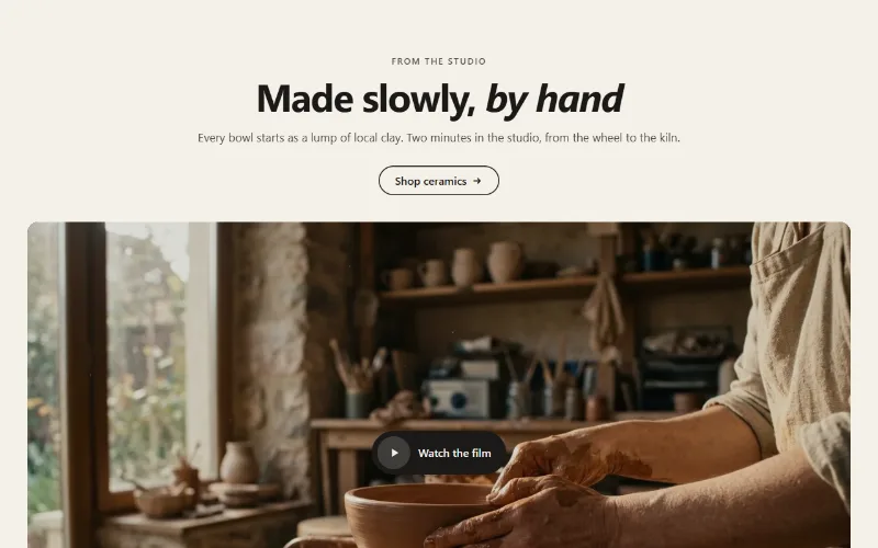
Image and video
Video
A Shopify, YouTube or Vimeo video as an inline player, a muted background loop, or a poster that opens a lightbox. Nothing loads until play.
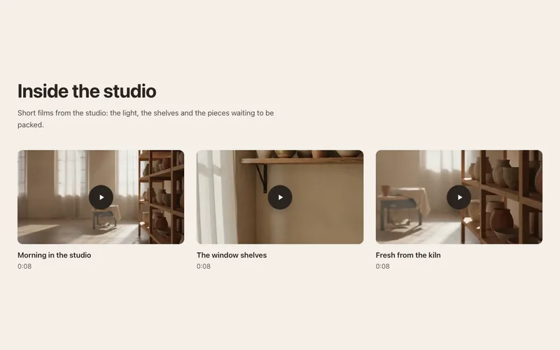
Image and video
Video gallery
A grid of video posters that open in an accessible lightbox. Shopify, YouTube or Vimeo videos; nothing third-party loads until a shopper presses play.
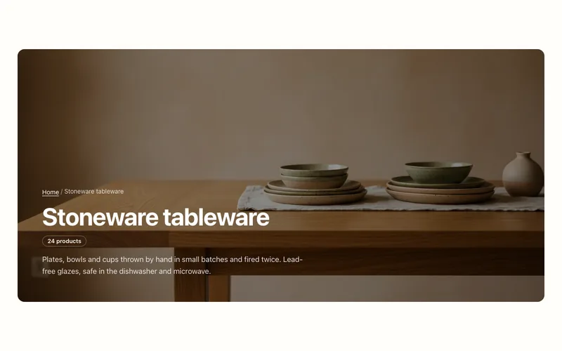
Hero and banners
Collection banner
Collection page header with the collection's title, description, image and product count, over the image or beside it, plus an optional breadcrumb.
