Image banner grid
Two to four linked promo tiles in a mosaic or row, each with desktop and mobile images, heading and button. Whole tile clickable, stacks or swipes on mobile.
- Category
- Hero and banners
- Use on
- Home, Landing pages, Collection
- Reads
- Content only
- Size
- 23 KB, no JavaScript
- License
- MIT, free for client work
In short
Image banner grid is a free Shopify section that puts two to four linked promo tiles side by side, in a mosaic with one tall tile or in an equal row, for campaigns and category entry points. Each tile has a desktop and a mobile image with focal points, a heading, a short line and a button-style label, placed per device over a soft shade that keeps the text readable on any photo. A linked tile is a single link, so the whole tile is the click target; on mobile the tiles stack or become a swipeable row. Pure Liquid and CSS for Online Store 2.0 themes, without an app.
When to use it
- Home page entry points to three or four main categories, under the hero
- A seasonal campaign block: the sale, new arrivals and gifts in one mosaic
- A collection page header that links to sub-collections
In the theme editor
- Heading (tag H1–H3 or paragraph, three sizes) and intro text
- Tile blocks (2–4): desktop and mobile image, heading, text, button label and style, link, new tab, text position per device
- Mosaic or equal row on desktop, stacked or swipeable row on mobile
- Tile height per device, space between tiles, corner radius, tile heading size, shade strength
- Page or full width, heading alignment per device
- Background color or gradient, text, tile text, shade, button and button text colors
- Top and bottom padding per device, show on desktop/mobile only, anchor ID, image zoom on hover
Files
sections/lib-image-banner-grid.liquidView the code
snippets/lib-image.liquidView the code
Written in plain Liquid and CSS, with no JavaScript. No app, no dependencies.
How to add it to your theme
- Copy the section file into your theme’s sections folder, and any snippet it lists into snippets.
- In the theme editor, choose Add section and pick the one that starts with “Lib ·”.
- Replace the sample text with your store’s own, and set the colors to match your brand.
Questions
- How many tiles can I add, and how do they arrange?
- Two to four. In the mosaic layout three or four tiles put the first one tall on the left; with four, the last one runs across the bottom right. The equal row puts them side by side (two per row on tablets when there are four). On mobile they stack or swipe.
- Can I use different images on mobile?
- Yes. Each tile has a desktop image and an optional mobile image, and both honour the focal point you set in Shopify's image editor, so the subject stays in frame at every size.
- Is the whole tile clickable?
- Yes, when the tile has a link: the tile is one link containing the heading, line and button label, so shoppers can tap anywhere and screen readers hear one clear link. Tiles without a link are plain images with text.
- Will white text stay readable on light photos?
- A shade fades in from the text's side; you set its color and strength (0–90%) once for the section. Text position is set per tile and per device.
Before you publish
- The text in the demos is sample content. Replace it with facts about your own store before you publish.
- Animations are switched off for visitors who ask for reduced motion.
- We check every file with Shopify Theme Check before publishing it here.
Need it adapted to your theme, or a section that isn’t here? See Shopify theme development.
More sections
Hero and banners
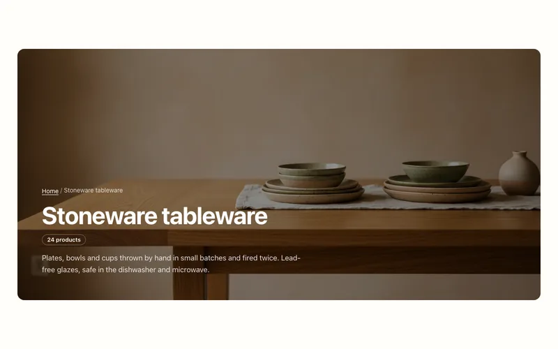
Collection banner
Collection page header with the collection's title, description, image and product count, over the image or beside it, plus an optional breadcrumb.
Hero and banners
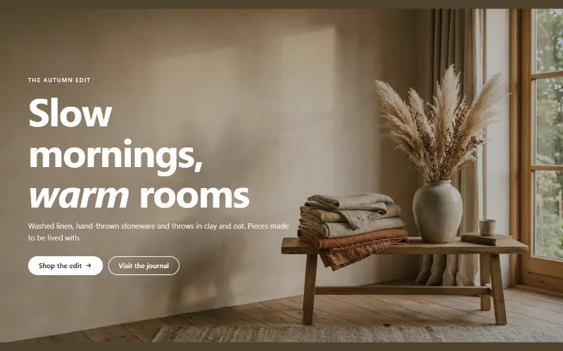
Hero banner
A full-bleed image banner with eyebrow, heading, text and two buttons over it, a separate mobile image, overlay, nine content positions and height per device.
Hero and banners
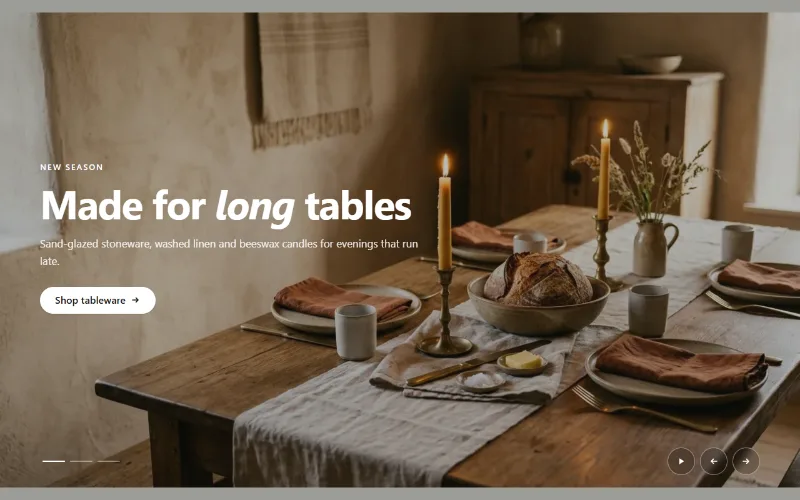
Hero slideshow
A full-width hero slideshow of up to six slides, each with its own desktop and mobile image, overlay, text and button. Swipe, autoplay, arrows and dots.
